Digi-Key Order and Review
Until now, I’ve been ordering all my electronics supplies through the excellent Finnish firm Partco. However, after running out of ATtiny85 chips I just couldn’t make myself pay 5.90€ ($7.80) when the same part was available for third the price from Digi-Key. I decided to try the fabled distributor myself. In case you haven’t tried them yet, read on for my experiences.
Website and Shopping Process
It is surprising how such a successful electronics component retailer is able to operate with such a poorly laid out and difficult to use website. From a usability standpoint, it’s a prime example of how not do design a web store. There’s so much to critize it’s hard to know where to begin, but here my top annoyances for the front page alone:
- Most prominent items are the site ad and a rotating banner. First will become redundant after initial visit (possibly even before), and with 600 000 products stocked, the second banner has a very low probability of being of interest
- Most of the 11 choices in navigation pane are for functionality that is not relevant for most visits – product index and order handling would likely cover 98 % of user needs
- No color coding or any other visual aid is used to group menu items in general categories (I’d categorize them as “Ordering”, “Products”, “Information and Resources” and “Help”)
- Product hierarchy is not built into navigation in any way – you essentially have to start all over again if you find out that the sub-category you chose wasn’t the correct one
- The “interactive catalog” that I mistakenly first went into (instead of “product index”) is essentially a e-paper version of 3000 page catalog. A link to such monster should be buried deep instead of frustrating first-time (and possibly last-time) visitors
- Overall, no visual sections other than “red boxes” exist in the user interface, making it hard to group different types of information
Once I had convinced myself that the only useful things on web site were the Search box and Product Index, I was free to browse the extremely wide selection of components Digikey had to offer. And here comes a second annoyance, the browsing of component selection: Digikey has 2-level product hierarchy with 44 top level categories and probably about 500 second level categories. Only way to browse them is the 8 page long product index, so no “casual browsing” will ever happen.
Furthermore, be prepared to get frustrated with category choices. Looking for a USB-to-serial IC? Would that be a “interface controller” or a “interface tranceiver”? Or maybe a “UART interface”? Surely not a modem? The problem stems mainly from the large selection and is hard to alleviate, but as we’re about to see, Digikey has built an excellent product database, so the potential is there to make something better than the current solution.
The Product Search
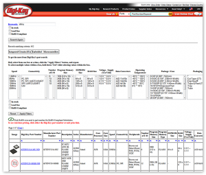
Once you have either used the search functionality or miraculously found an interesting subcategory to browse, you will find that Digikey folks have entered quite a lot of useful information for each type of subcategory. For example, ICs / UARTs category has 17 attributes one can use to limit the initial set of 1,162 records. However, a few silly shortcomings hamper the experience.
First and foremost issue with search is that there is no “back” or “remove filter” option present in the UI. This is just horrible, horrible idea. Once you discover that the browser’s back button (which nowadays most people have learned not to try to use when searching) does work, the problem is slightly alleviated, but Digikey people should really try out B&H Photo‘s attribute system and learn some lessons.
Second problem is, that attribute categories are not mutually exclusive. Instead, one can immediately see that they are in most cases manually entered descriptions. If I want a chip that works with 3.3V, I need to select 25 (!) different choices out of ~40 manually, because there are things like “2.5 V, 3.3 V” and “2.5V, 3.3V” as separate items. Actual boolean, set, and range data types would remove this problem. Some smaller, yet annoying issues:
- Once first filter is added, the URL changes to a dksus.dll and you cannot get back to sub-category “front page” anymore. It’s not 1998 anymore, guys!
- No indication is given how many products satisfy a given criteria – you can jump from 500 hits to zero just by adding one filter. Dynamic product counts for different search options would be a huge leap forward.
- If only 1 hit is found, user is transported to the page of that single hit. This confused me every time it happened.
- Sorting by Unit Price gives the same Advanced/Simple search dialog every single time. It stops being fun after 2 hours, I can tell you. “Remember this choice” checkbox, anyone?
On plus side, stock levels and prices are easy to see, and the fact that product attributes exist make it possible to find anything at all from such a vast inventory. So once I know I want a 8-bit AVR part with DIP package that is in stock, I’m able to find all such products rather easily. But the experience is more like the old-time shop where you tell the clerk what you want, not the modern “walking the aisles and picking up interesting-looking things” -type.
Ordering
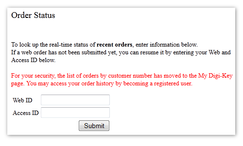
Adding stuff to order is really easy, and an order stays in the system for several weeks before disappearing. I wanted to reach the $100 minimum order for free shipping to Finland, so I simply reserved an evening to go through all interesting categories and added a little bit of everything. After I was done, it was almost 1 AM and I decided to postpone the order to the next day. That is when I found out that even you can register to Digikey, it doesn’t save your “shopping cart” under your account, but instead uses an arcane “Web ID” / “Access ID” system where you have to remember two strings of digits to be able to view your own order. I hope you memorized these numbers when you logged out:
Obviously the idea of a persistent shopping cart tied to user account has only occured to Digikey very recently, having been bread and butter of most e-commerce sites for a decade. Thankfully I had saved my order view on the previous night, so I was able to salvage my order – after entering the two magic numbers, I was back in business and placed the order without any problems.
Delivery and packing
Once I had managed to place my order, everything went superbly. After few hours, I received an e-mail with UPS tracking code, and the parcel traveled from US to Finland over the weekend. After placing the order late Thursday evening, I had the parcel in my hands the following Monday. And the fact that such service is free of charge for orders exceeding $100 is just amazing.
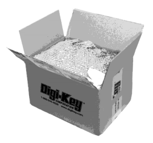
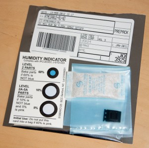
I immediately proceeded to open the parcel and examine the contents. I really must say the Digikey folk know how to pack stuff. Everything was clearly labeled, nicely sealed, in top condition and just perfect. What really impressed me was that surface mount components were sealed in bags with moisture-absorbing material and a moisture indicator sheet.
Everything I ordered was in the box, and now I’m only waiting the tax and customs invoice from UPS – it’s unfortunate that after those, the end price in euros is essentially the same as the Digikey price in dollars, even if 1€ is almost $1.33. Thankfully Digikey prices are also rather good!
Summary
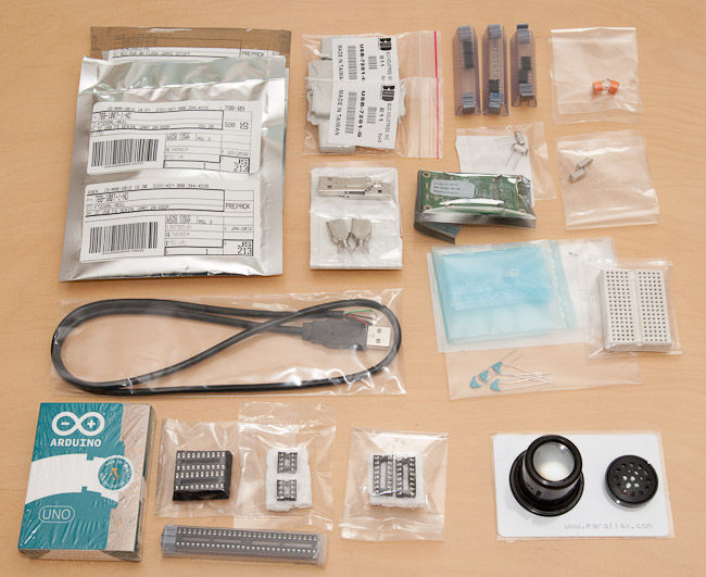
So to summarize, my experience on Digikey was definitely a mixed one – very frustrating product selection and ordering process followed by extremely well executed delivery and reasonable pricing. I think I’ll definitely use Digikey again when I have a larger batch of specific components in mind. However, I think I’ll try Mouser or SparkFun next for my random electronics purchases, to get some feel on how they compare to Digikey. But I think I’ll get some interesting projects done with this batch already:
(if you do the math, you’ll notice that the above items are not quite $100 – I actually also ordered an Arduino for a friend, too :)
